#SVG (Part 2)
It has been a while since my last post about SVG, the Table of Contents (ToC) design of Fumadocs also inspired many other cool designs.
I would like to dive into the core idea behind some recent improvements to Fumadocs' TOC.
#Basic Idea
You can find the source code at GitHub.
Here I assume you have read my last post about SVG, the newer Toc is basically the same idea, but added curvedness using the C command.
For example, this is the updated code of the svg between each div component.
<svg
  xmlns="http://www.w3.org/2000/svg"
  // control the SVG viewport:
  viewBox={`${Math.min(offset, upperOffset)} 0 ${Math.abs(upperOffset - offset)} 12`}
  style={{
    // " + 1" is needed because of stroke-width
    width: Math.abs(upperOffset - offset) + 1,
    height: 12,
  }}
>
  <path
    // the actual path
    d={`M ${upperOffset} 0 C ${upperOffset} 8 ${offset} 4 ${offset} 12`}
    stroke="black"
    strokeWidth="1"
    fill="none"
    className="stroke-fd-foreground/10"
  />
</svg>-
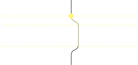
We denote the x-offset of upper item by
upperOffset, and the x-offset of item belowsvgelement byoffset. -
viewBox: the format isx y w h,x yis similar to the coordinates of origin, everything is rendered relative to it.w his simply the size of SVG viewport. -
C x1 y1 x2 y2 x yis the key command we use, it generates a cubic Bézier.The mdn docs have a good explanation of the
Ccommand:The last set of coordinates here (x, y) specify where the line should end.
The other two are control points. (x1, y1) is the control point for the start of the curve, and (x2, y2) is the control point for the end.
The control points essentially describe the slope of the line starting at each point. The Bézier function then creates a smooth curve that transfers from the slope established at the beginning of the line, to the slope at the other end.
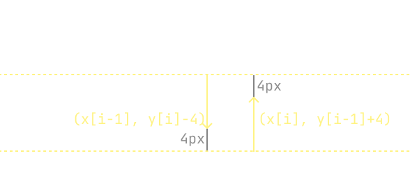
In practice, we use
(x[i - 1], y[i] - 4)and(x[i], y[i - 1] + 4)as control points,(x[i], y[i])as end point, wherex[i]&y[i]means the coordinates of ithdiv.
We can vistualize the points as:
Same for the client-side thumb SVG generator function:
if (i === 0) {
  d += ` M${offsetX} ${offsetY} L${offsetX} ${offsetY + height}`;
} else {
  d += ` C ${upperOffsetX} ${offsetY - 4} ${offsetX} ${upperOffsetY + 4} ${offsetX} ${offsetY} L${offsetX} ${offsetY + height}`;
}
Which is used for generating the above SVG line for ToC.
#Animating Thumb
Previously, we used mask-image + transform for animating the thumb.
By applying a mask on the animated div, we can highlight a certain part of the ToC outline.
<div
  style={{
    maskImage: "<the encoded svg>",
  }}
>
  <div
    id="moving-bar"
    style={{
      backgroundColor: "red",
      // control the position
      transform: "<animated>",
      // control the vertical size
      height: "<animated>",
    }}
  />
</div>
This approach requires adding transition to height as well, which triggers layout re-arrangement (something that can be costy for rendering engines).
We can switch to clip-path, so by only animating the clip-path we can avoid the layout re-arrangement cost.
<div
  style={{
    clipPath: "<animated-box>",
  }}
>
  {/* it doesn't need to encode the svg */}
  <svg stroke="red">...</svg>
</div>
It is still the same idea of masking a highlighted div, but instead we construct a SVG, then mask it using the moving box.
The moving box is defined in clip-path as a rectangle, which can be animated with transition.
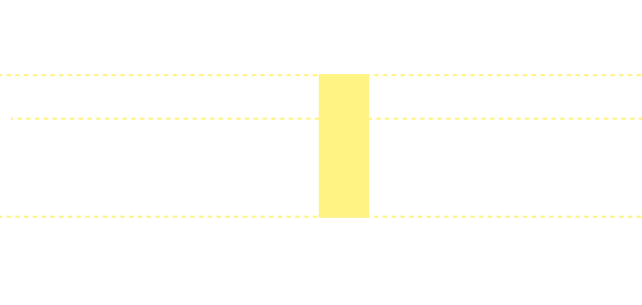
#Thumb Box
There is a tiny circle at the end of thumb, let's denote that by the "thumb box".
The thumb box is relatively easier to create, just position it to the either top or end of the thumb.
<div
  style={{
    position: "absolute",
    width: 4,
    height: 4,
    backgroundColor: "red",
    transition: "translate 150ms",
    // 1.25px because the size of circle is 4x4px
    translate: `calc(${offset}px - 1.25px) ${top}px`,
  }}
/>
But another problem is how do we animate it, obviously when the position changes it will fly all over the place, rather than sticking to the TOC outline.
Currently, I kept it as-is since it will be resource-consuming to ensure the box sticking to TOC outline.
But it is definitely possible to workaround this, using browser-side JavaScript, it is easy to locate the y-position of the box. We want to obtain the corresponding x-position of box from SVG path.
I have explored offset-path, it is similar to translate but always ensure the element lies on a given path, instead of (x, y), it takes offset-distance: the path distance between starting point and the element's position.
But it only accepts path distance, there is no way to find the actual path distance from a given y-posiiton.
It turns out we must solve for the x at a given y, and this task is not trivial - it is equivalent to solving a high-order polynomial function.
Luckily, there is no duplicated solutions. If you don't care about performance, you can use getPointAtLength() and keep iterating until you found a length that's very close to our given y.
I'll skip the actual coding part as it is relatively straightforward.
#Thanks for Reading
This time I have put more effort on the actual implementation part, hope you will find it useful.